Skip to main content

How to Decorate with Green

Green makes me feel optimistic and refreshed. I find it's the easiest on the eyes and should be used to relax and create balance in a design. It's also a really versatile colour to decorate your home with but having incorporated into mine many times over, I’ve come away with a few observations and tricks I’d like to pass onto you…
The first, is to be sure to scan the natural light before selecting a green paint colour. If you’re working with limited natural light, consider going a few shades lighter on the green paint because it’ll inevitably look darker once it’s on the walls.Should your light have warmer tones; reds, pinks or oranges, you’ll want to counter that in the green colour you select by choosing a cooler hue.
If in doubt, go for a muted shade of green paint. I really like Bone by Farrow & Ball. In general, lighter and less-saturated colours are more soothing on the eyes, you could even mix your green paint colour with a dash white paint to get a more pastel green. The lighter the colour, the larger the space will seem.
If you don't feel comfortable committing to painting your walls, consider installing linoleum on the floor which will give your space an instant refresh. Sinclair Till has a lovely range. I particularly like their forrest green one.
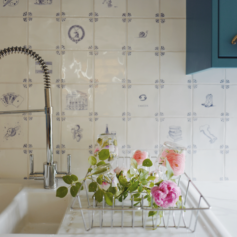
Get creative with green accents. By this I mean accessories, think lime green embroidered scatter cushions, mint coloured throws or beautiful emerald green zellige tiles for a sink backsplash.